Our Blog
Responsive Website Design: How to Build a Site That Looks Great on Every Screen
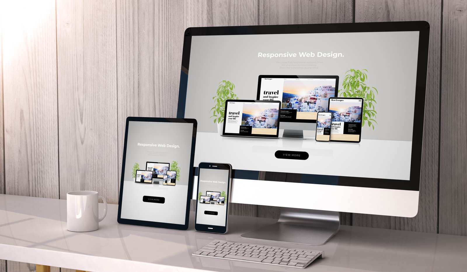
Responsive website design is a way of building websites so the layout, images, and text adjust automatically to the screen they’re viewed on, whether that’s a phone, tablet, laptop, or large desktop monitor. Instead of making separate versions of your site for each device, you build one flexible site that adapts on its own.

Ready to Elevate Your Digital Presence?
Schedule your free consultation and discover how our expert teams can deliver high‑quality web development and design—fast.

Nanolix Digital is a UI/UX design agency and web development company delivering custom digital solutions, professional website design, brand identities, and digital products for growth-focused businesses.


 Office 401, Plaza 06, Eiffel Tower Commercial, Bahria Town Phase 8, Rawalpindi
 info@nanolixdigital.com
 +16463499973
© Copyright 2026, Nanolix Digital All Rights Reserved