
Brand & Visual Design
White Horizon
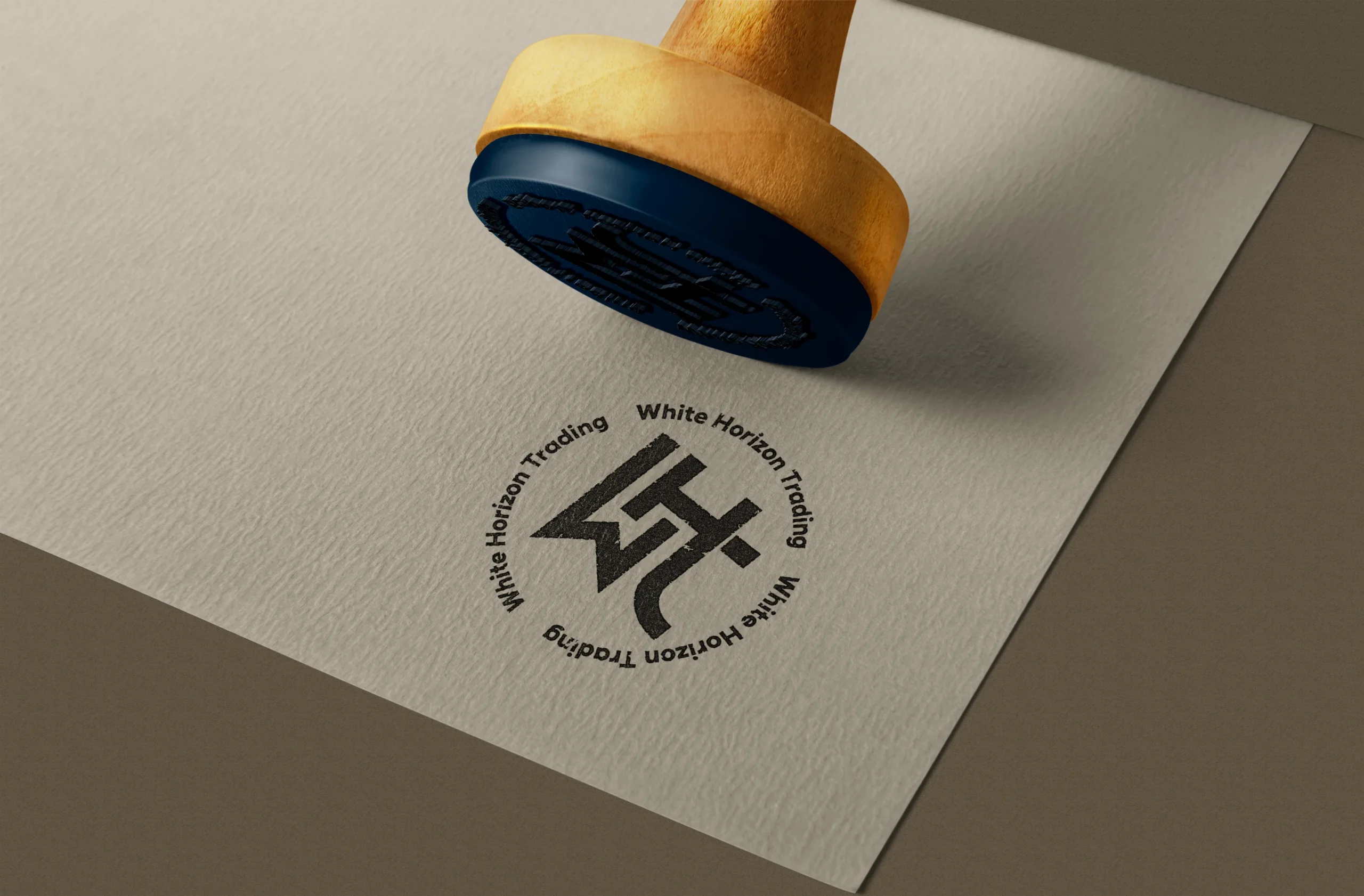
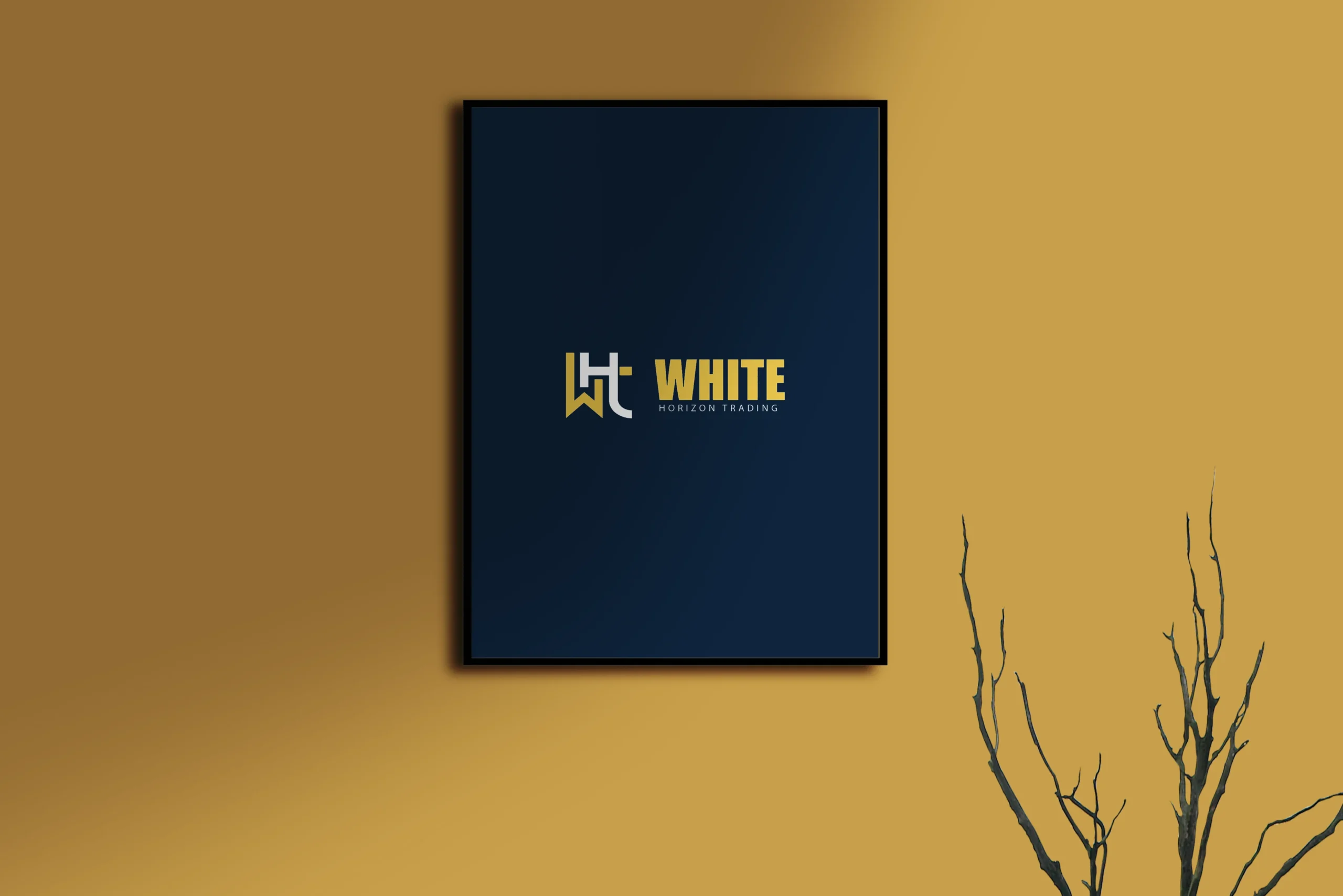
We partnered with White Horizon to create a sleek and professional visual identity for a modern trading firm, developing a system that extends across the logo, corporate stationery, and marketing assets to build consistency across everyday business touchpoints.
Client
White Horizon
Industry
Trading · Corporate Services
Timeline
1 Week
Year
2024
Project Overview
Creating a trading identity built around trust, clarity, and consistency
White Horizon needed a visual identity that could feel established, professional, and modern across both formal business communication and outward-facing marketing materials.
For trading firms, brand credibility is often shaped through documents, presentations, and other day-to-day touchpoints long before a client or partner has a deeper interaction with the company. Current identity guidance for trading and professional firms similarly emphasizes consistent logo systems, typography, stationery, and formal documents as important signals of trust and operational maturity.
We developed a cohesive identity that gives White Horizon a more recognizable corporate presence while remaining flexible enough to work across different formats and business contexts.
- 01
Create a professional visual identity that communicates confidence and credibility.
- 02
Build a system that remains consistent across stationery, business documents, and marketing materials.
- 03
Give White Horizon a modern visual presence without relying on short-lived design trends.
- 01
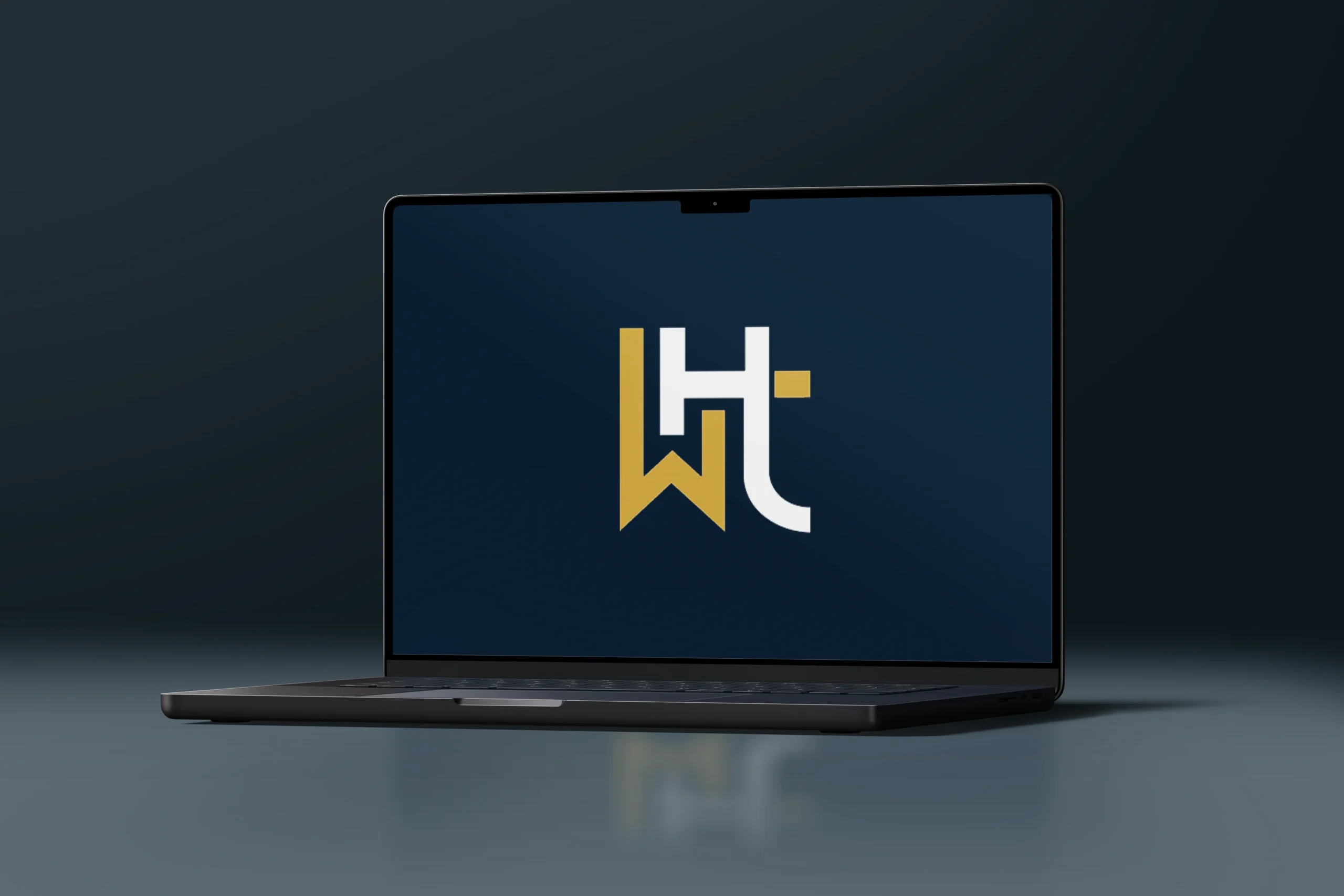
A distinctive logo established the foundation for White Horizon’s visual presence.
- 02
Corporate stationery extended the identity into the documents and materials used in everyday business communication.
- 03
03 Marketing assets carried the same typography, visual language, and brand structure into outward-facing communication.
Gallery
A closer look


Our Process
From corporate direction to a complete visual identity
Discovery
Defined the personality White Horizon needed to communicate, with a focus on professionalism, reliability, modernity, and the environments where the brand would appear most often.
Identity Design
Developed the logo, typography, and core visual language that established the foundation of the brand.
Corporate Applications
Extended the identity across stationery and marketing materials to ensure the system worked consistently in practical business use.
Refinement
Polished the complete set of assets and prepared a cohesive visual system for ongoing communication.
Key Features
What we built
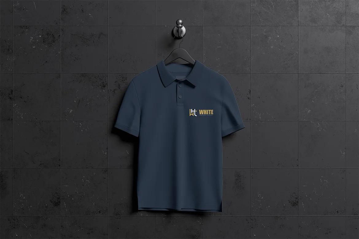
A Corporate Identity Built for Credibility
The logo, typography, and visual styling were designed as one connected system, giving White Horizon a professional presence that feels clear, confident, and appropriate for a modern trading business.
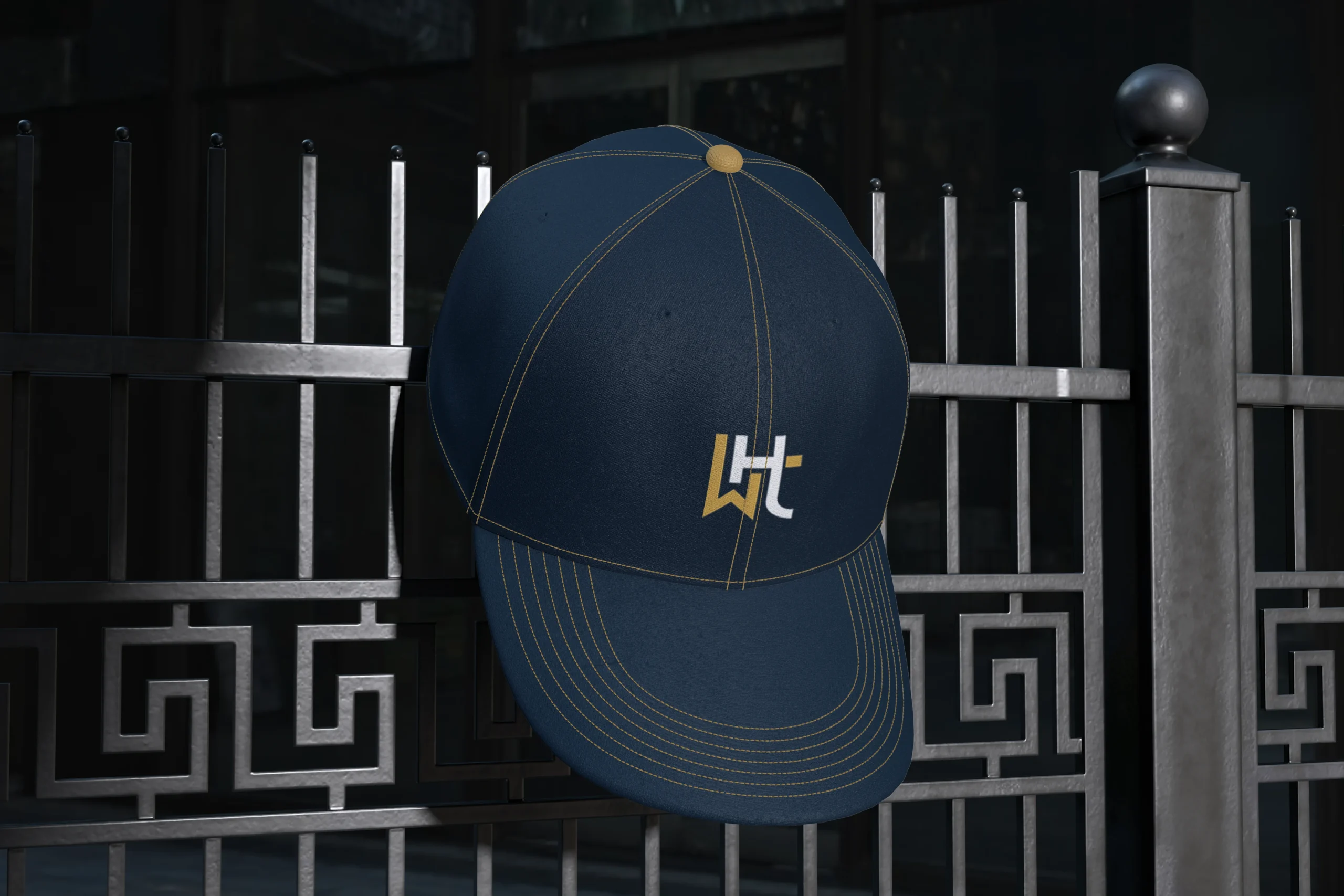
Stationery That Extends the Brand
The identity was translated into stationery and business materials so the brand remains consistent in the places where professional credibility is often judged most directly.

Ready to Elevate Your Digital Presence?
Schedule your free consultation and discover how our expert teams can deliver high‑quality web development and design—fast.

Nanolix Digital is a UI/UX design agency and web development company delivering custom digital solutions, professional website design, brand identities, and digital products for growth-focused businesses.


 Office 401, Plaza 06, Eiffel Tower Commercial, Bahria Town Phase 8, Rawalpindi
 info@nanolixdigital.com
 +16463499973
© Copyright 2026, Nanolix Digital All Rights Reserved