Dashboard UI Design
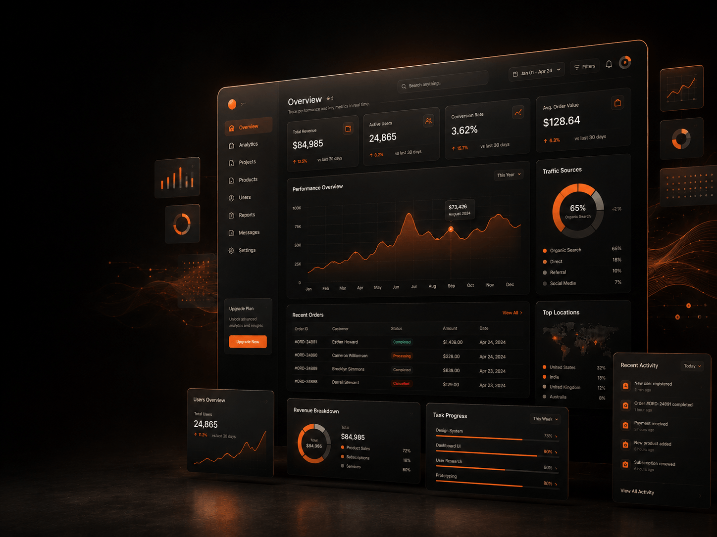
Dashboard UI design that makes complex data easier to understand.
We design dashboards that organize data, actions, filters, and workflows into clear interfaces users can understand and use with confidence.
- Data dashboard design
- Web dashboard design
- Dashboard wireframe
- SaaS dashboards
- Admin panels
The Problem
Most dashboards fail because they show too much at once.
Dashboards are built to help people make decisions. Good dashboard UI design fixes the problems by making the most important information easier to see, compare, and act on.
Our job is to turn complex information into a dashboard experience that feels clear, focused, and easy to use.
What's Included
What our dashboard UI design service includes
Data Dashboard Design
We design data dashboard interfaces that organize KPIs, charts, tables, filters, and alerts into a clear visual system.
Web Dashboard Design
We create web dashboard design layouts that help users navigate sections, compare data, manage workflows, and complete tasks without confusion.
Dashboard Wireframe
We map the layout, data blocks, filters, navigation, tables, charts, and user actions so your team can review the experience early.
This helps avoid building a dashboard that looks good but feels hard to use.
SaaS Dashboard UI Design
We design dashboard interfaces that support onboarding, feature discovery, account activity, reporting, settings, and product workflows.
Admin Dashboard Design
We design admin interfaces that help users manage content, orders, users, reports, settings, permissions, and workflows with less friction.
Dashboard Prototype
We create clickable dashboard flows so stakeholders, users, and developers can review navigation, filters, interactions, tables, charts, and key actions early.
Data Dashboards
Data dashboard design that helps users see what matters first.
What We Design
KPI cards
Metric groups
Charts and graphs
Trend views
Comparison blocks
Tables
Filters
Alerts
Status indicators
Report views
Web Dashboards
Web dashboard design for platforms people use every day.
What We Improve
Navigation structure
Data grouping
Table layouts
Filter behavior
Search flow
Empty states
Error states
Action buttons
Mobile and tablet views
User role views
Deliverables
Dashboard UI design deliverables
Everything you receive at the end of a dashboard engagement, ready to review, test, and hand to your development team.
- Dashboard UI design
- Data dashboard design
- Web dashboard design
- Dashboard wireframe
- SaaS dashboard design
- Admin dashboard design
- Dashboard prototype
- KPI card layouts
- Chart and table layouts
- Filter and search flows
- Navigation structure
- Empty and error states
- Responsive dashboard layouts
- Figma design files
- Developer-ready handoff

Ready to make your dashboard easier to use?
Share your product, data, or current dashboard and we'll show you what to simplify first.

Nanolix Digital is a UI/UX design agency and web development company delivering custom digital solutions, professional website design, brand identities, and digital products for growth-focused businesses.


 Office 401, Plaza 06, Eiffel Tower Commercial, Bahria Town Phase 8, Rawalpindi
 info@nanolixdigital.com
 +16463499973
© Copyright 2026, Nanolix Digital All Rights Reserved